


WATERCOLOURS FROM SAND AND FOG 0
(Exhibition of watercolours of Laima Drazdauskaitė at the Graphics Gallery) Kotryna Džilavjanaitė
www.kamane.lt, 2007 10 19
Photographs by Egidijus Rudinskas and Laima Drazdauskaitė.
“If we look through the prism of sand, all things which have a form are unreal. Only the movement of sand which denies any form is real” (Kobo Abe, “Woman in the Dunes”).
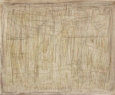
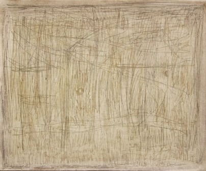
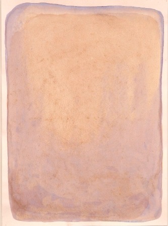
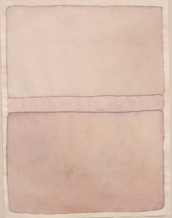
Woman in the dunes – such an image appears in mind while looking at the watercolours of Laima Drazdauskaitė. A woman who is trying to tame and curb sand, to know its real nature. Her watercolours grant structure to sand, and the damp paper captures sand trying to escape. The intangible elements – sand, mist, water obtain a weightless but clear and even strict form here.
L.Drazdauskaitė dips into a motive deeply – she intersperses bits of dunes in the watercolour, knits them into a spongy knitting rhythmically, washes by the water of the lagoon, mixes it with fog or drizzle. She succeeds in understanding the abstract character of sand, in granting form to something that has no shape.
The constantly moving and changing material is constrained, stopped and dammed in the watercolours of Laima. Sometimes it is held by white areas of paper, sometimes – by the fragile but demanding paint line. Such clear stressing of borders creates the impression of a fragmentary work – it seems that the author has split a small part of the view and has magnified it to the very atom.
There are some works of a more distant space in which more recognisable images of the horizon are pictured – the beach, motifs of waves. Despite this, it is hard to call these watercolours landscapes not only due to the single-plan and flat perspective and minimal artistic language. It seems that the aim of the author is to render the depth of existence that is hidden behind elements of nature.
The subtle and extremely sensitive selection of colours assists the painter in this. The collected impressions of the seaside are pictured in soft foggy tones. They picture the colour changes of the dunes – from golden colour burnt in the sun to the damp grey shade of the sand mixed with shells. The space created by the painter breathes with primordial naturalness and reminds of the world that has just been created.
What does “the woman in the dunes” Laima Drazdauskaitė say about her works?
- You have always drawn much, worked with watercolour, ink. Why are the works created in this technique shown to Kaunas audience only now?
- I did not create exhibition works earlier until I was provoked by the offer to organise an exhibition in Poland, Wroclaw. It is hard to transport oil canvases, and it is possible to put watercolours into a folder and carry them simply. I exhibit only a small part of works presented in Poland at the Graphics Gallery.
- Is the watercolour technique special for You in some way? Was it the most suitable to render the chosen motifs?
- Watercolour is charming for the fact that it allows speaking in a very clear language. This is why I wanted to create these motifs with the help of watercolour – it would not be possible to paint them in oil.
- Your new exhibition is the reflection on holidays at the seaside. Such motifs as the sea, the dunes are considered banal in painting usually. Did you succeed to discover an authentic plastic solution easily?
- The nature of Nida was a great challenge to me, I felt that its motifs intrigued me. A motif hides plastic in itself, one only has to be able to read it and find a relation with it. Looking at a wave, I see how it floods the shore and then recedes leaving a trace in the sand. Water, wind leave their traces. It was interesting to me to see how aesthetics might be created from this, how the motif could be revealed in an original manner.
- Works of abstract minimal forms make one concentrate on the colours. What is your relation with the colour?
- I try to feel the colour as the motif itself, its primal structure. I am always searching for very precise nuances. The colour should be in the same tonality as the motif. The structure and colour speak together – both of them are speaking in very a simple language.
